Sidebars are one of the most complex components to build. They are central to any application and often contain a lot of moving parts.
We now have a solid foundation to build on top of. Composable. Themeable. Customizable.
Installation
Usage
<script lang="ts">
import * as Sidebar from "$lib/components/ui/sidebar/index.js";
import AppSidebar from "$lib/components/app-sidebar.svelte";
let { children } = $props();
</script>
<Sidebar.Provider>
<AppSidebar />
<main>
<Sidebar.Trigger />
{@render children?.()}
</main>
</Sidebar.Provider><script lang="ts">
import * as Sidebar from "$lib/components/ui/sidebar/index.js";
</script>
<Sidebar.Root>
<Sidebar.Header />
<Sidebar.Content>
<Sidebar.Group />
<Sidebar.Group />
</Sidebar.Content>
<Sidebar.Footer />
</Sidebar.Root>Composition
Use the following composition to build a Sidebar layout:
Sidebar.Provider
├── Sidebar.Root
│ ├── Sidebar.Header
│ ├── Sidebar.Content
│ │ ├── Sidebar.Group
│ │ │ ├── Sidebar.GroupLabel
│ │ │ ├── Sidebar.GroupAction
│ │ │ ├── Sidebar.GroupContent
│ │ │ └── Sidebar.Menu
│ │ │ ├── Sidebar.MenuItem
│ │ │ │ ├── Sidebar.MenuButton
│ │ │ │ ├── Sidebar.MenuAction
│ │ │ │ └── Sidebar.MenuBadge
│ │ │ └── Sidebar.MenuItem
│ │ │ ├── Sidebar.MenuButton
│ │ │ └── Sidebar.MenuSub
│ │ │ ├── Sidebar.MenuSubItem
│ │ │ └── Sidebar.MenuSubItem
│ │ └── Sidebar.Group
│ │ └── Sidebar.Menu
│ │ ├── Sidebar.MenuItem
│ │ └── Sidebar.MenuItem
│ ├── Sidebar.Footer
│ └── Sidebar.Rail
├── Sidebar.Inset
└── Sidebar.TriggerStructure
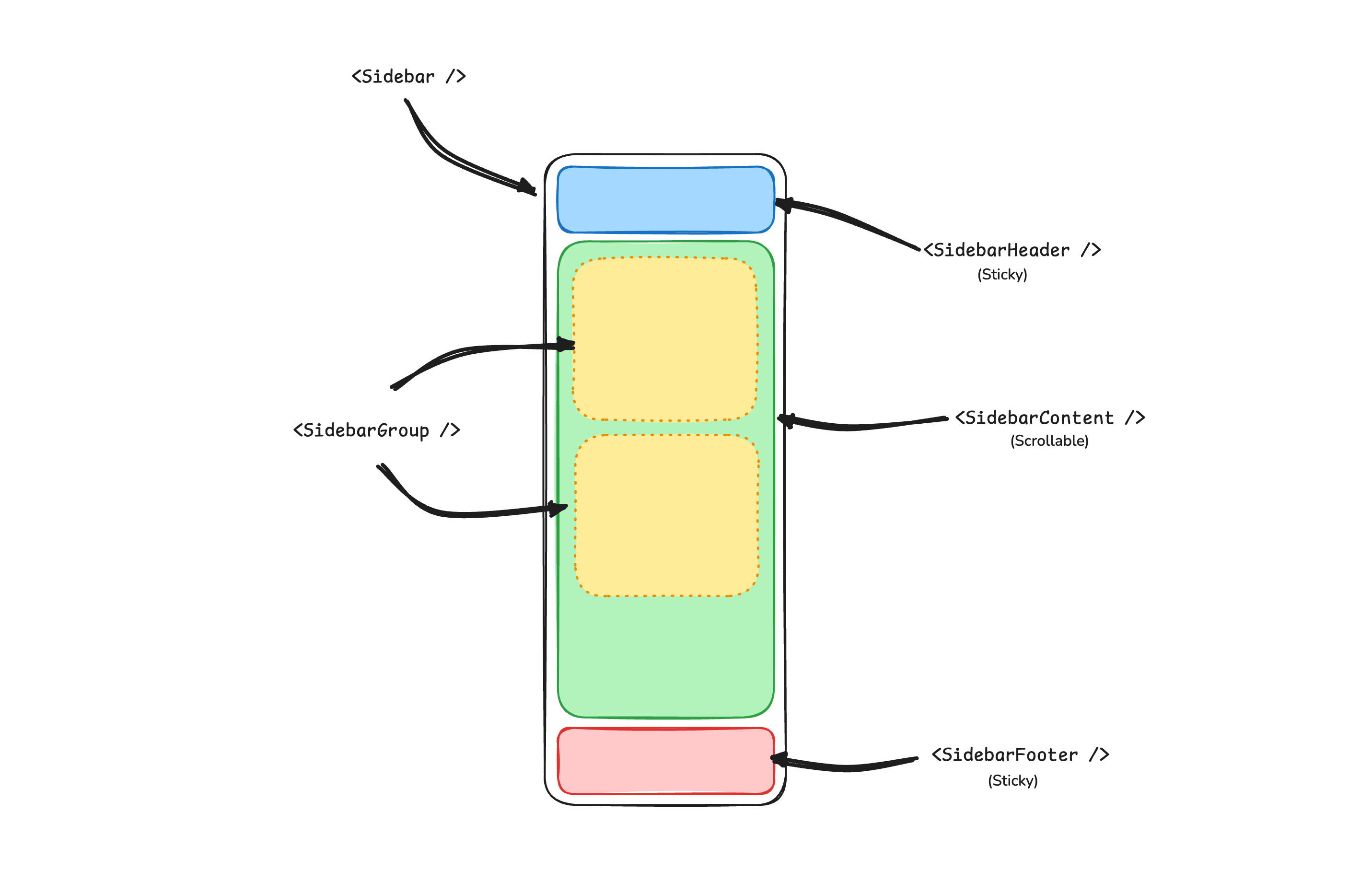
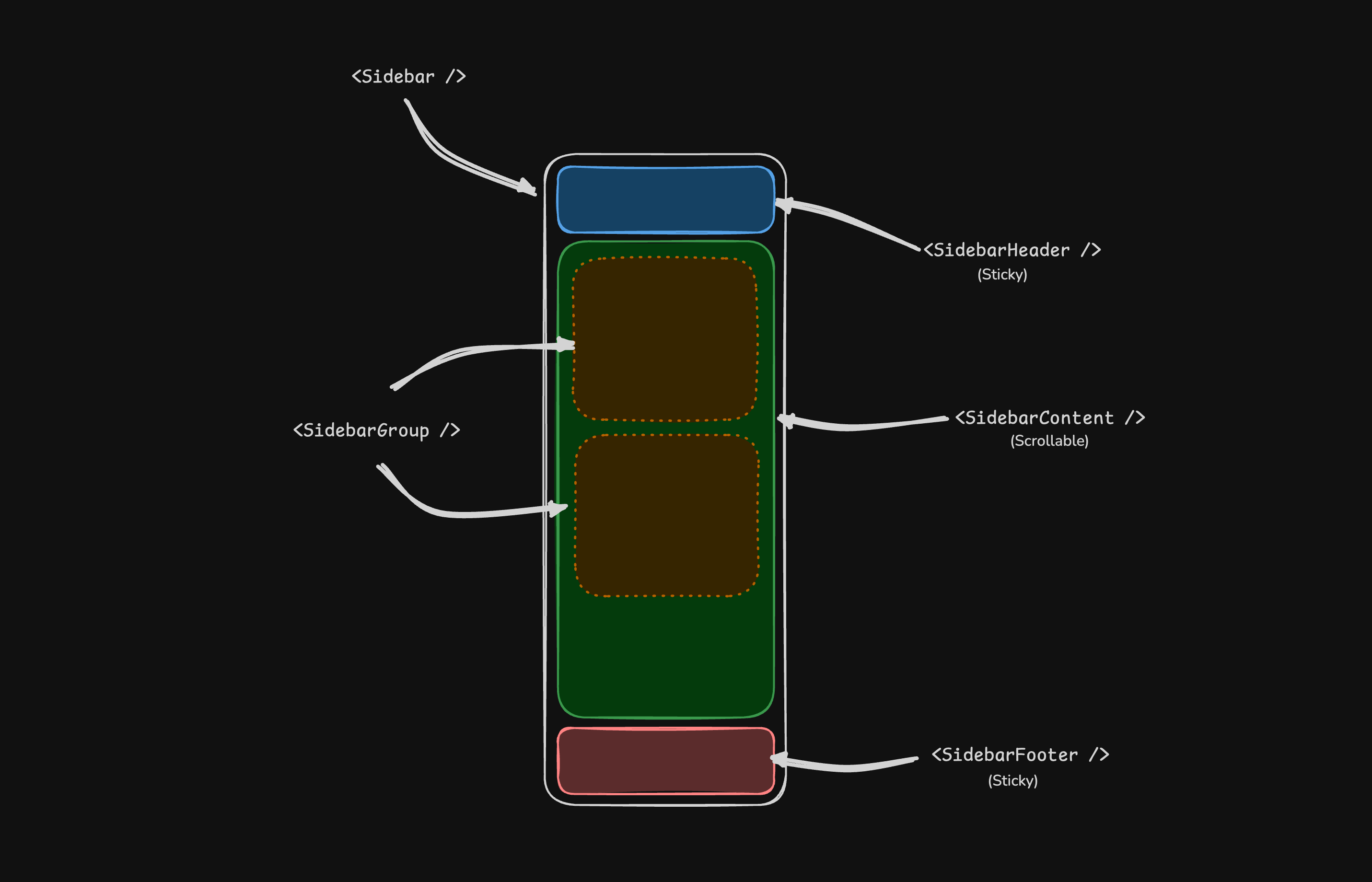
- Sidebar.Provider — Handles collapsible state and provides sidebar context to child components.
- Sidebar.Root — The main collapsible sidebar panel.
- Sidebar.Header — Sticky at the top; use for branding, titles, or workspace switchers.
- Sidebar.Footer — Sticky at the bottom; use for user menus, settings, or actions.
- Sidebar.Content — Scrollable region between the header and footer.
- Sidebar.Group — Groups related navigation with optional label, action, and content areas.
- Sidebar.Menu / Sidebar.MenuItem — Menu structure for links, badges, actions, and nested submenus.
- Sidebar.Rail — Resize handle for adjusting sidebar width when applicable.
- Sidebar.Inset — Wraps main content when using the
insetvariant. - Sidebar.Trigger — Control that toggles the sidebar open or collapsed.
Sidebar.Provider
The Sidebar.Provider component is used to provide the sidebar context to the Sidebar.Root component. You should always wrap your application in a Sidebar.Provider component.
Props
Width
If you have a single sidebar in your application, you can use the SIDEBAR_WIDTH and SIDEBAR_WIDTH_MOBILE constants in src/lib/components/ui/sidebar/constants.ts to set the width of the sidebar.
export const SIDEBAR_WIDTH = "16rem"
export const SIDEBAR_WIDTH_MOBILE = "18rem"For multiple sidebars in your application, you can use the style prop to set the width of the sidebar.
<Sidebar.Provider
style="--sidebar-width: 20rem; --sidebar-width-mobile: 20rem;"
>
<Sidebar.Root />
</Sidebar.Provider>Keyboard Shortcut
To trigger the sidebar, you use the cmd+b keyboard shortcut on Mac and ctrl+b on Windows.
export const SIDEBAR_KEYBOARD_SHORTCUT = "b"Sidebar.Root
The main Sidebar.Root component used to render a collapsible sidebar.
Props
Note: If you use the inset variant, remember to wrap your main content
in a Sidebar.Inset component.
<Sidebar.Provider>
<Sidebar.Root variant="inset" />
<Sidebar.Inset>
<main>{@render children?.()}</main>
</Sidebar.Inset>
</Sidebar.Provider>useSidebar
The useSidebar function is used to hook into the sidebar context. It returns a reactive class instance, so it cannot be destructured. Additionally, it must be called during the lifecycle of the component.
<script lang="ts">
import { useSidebar } from "$lib/components/ui/sidebar/index.js";
const sidebar = useSidebar();
sidebar.state;
sidebar.isMobile;
sidebar.toggle();
</script>Sidebar.Header
Use the Sidebar.Header component to add a sticky header to the sidebar.
<Sidebar.Root>
<Sidebar.Header>
<Sidebar.Menu>
<Sidebar.MenuItem>
<DropdownMenu.Root>
<DropdownMenu.Trigger>
</DropdownMenu.Trigger>
<DropdownMenu.Content class="w-(--bits-dropdown-menu-anchor-width)">
<DropdownMenu.Item>
<span>Acme Inc</span>
</DropdownMenu.Item>
</DropdownMenu.Content>
</DropdownMenu.Root>
</Sidebar.MenuItem>
</Sidebar.Menu>
</Sidebar.Header>
</Sidebar.Root>Sidebar.Footer
Use the Sidebar.Footer component to add a sticky footer to the sidebar.
<Sidebar.Provider>
<Sidebar.Root>
<Sidebar.Header />
<Sidebar.Content />
<Sidebar.Footer>
<Sidebar.Menu>
<Sidebar.MenuItem>
<DropdownMenu.Root>
<DropdownMenu.Trigger>
</DropdownMenu.Trigger>
<DropdownMenu.Content
side="top"
class="w-(--bits-dropdown-menu-anchor-width)"
>
<DropdownMenu.Item>
<span>Account</span>
</DropdownMenu.Item>
<DropdownMenu.Item>
<span>Billing</span>
</DropdownMenu.Item>
<DropdownMenu.Item>
<span>Sign out</span>
</DropdownMenu.Item>
</DropdownMenu.Content>
</DropdownMenu.Root>
</Sidebar.MenuItem>
</Sidebar.Menu>
</Sidebar.Footer>
</Sidebar.Root>
</Sidebar.Provider>Sidebar.Content
The Sidebar.Content component is used to wrap the content of the sidebar. This is where you add your Sidebar.Group components. It is scrollable.
<Sidebar.Root>
<Sidebar.Content>
<Sidebar.Group />
<Sidebar.Group />
</Sidebar.Content>
</Sidebar.Root>Sidebar.Group
Use the Sidebar.Group component to create a section within the sidebar.
A Sidebar.Group has a Sidebar.GroupLabel, a Sidebar.GroupContent and an optional Sidebar.GroupAction.
<Sidebar.Root>
<Sidebar.Content>
<Sidebar.Group>
<Sidebar.GroupLabel>Application</Sidebar.GroupLabel>
<Sidebar.GroupAction>
<Plus /> <span class="sr-only">Add Project</span>
</Sidebar.GroupAction>
<Sidebar.GroupContent></Sidebar.GroupContent>
</Sidebar.Group>
</Sidebar.Content>
</Sidebar.Root>To make a Sidebar.Group collapsible, wrap it in a Collapsible.
<Collapsible.Root open class="group/collapsible">
<Sidebar.Group>
<Sidebar.GroupLabel>
</Sidebar.GroupLabel>
<Collapsible.Content>
<Sidebar.GroupContent />
</Collapsible.Content>
</Sidebar.Group>
</Collapsible.Root>Sidebar.GroupAction
Use the Sidebar.GroupAction component to add an action to a Sidebar.Group.
<Sidebar.Group>
<Sidebar.GroupLabel>Projects</Sidebar.GroupLabel>
<Sidebar.GroupAction title="Add Project">
<Plus /> <span class="sr-only">Add Project</span>
</Sidebar.GroupAction>
<Sidebar.GroupContent />
</Sidebar.Group>Sidebar.Menu
The Sidebar.Menu component is used for building a menu within a Sidebar.Group.
A Sidebar.Menu is composed of Sidebar.MenuItem, Sidebar.MenuButton, Sidebar.MenuAction, and Sidebar.MenuSub components.
<Sidebar.Root>
<Sidebar.Content>
<Sidebar.Group>
<Sidebar.GroupLabel>Projects</Sidebar.GroupLabel>
<Sidebar.GroupContent>
<Sidebar.Menu>
{#each projects as project}
<Sidebar.MenuItem>
<Sidebar.MenuButton>
</Sidebar.MenuButton>
</Sidebar.MenuItem>
{/each}
</Sidebar.Menu>
</Sidebar.GroupContent>
</Sidebar.Group>
</Sidebar.Content>
</Sidebar.Root>Sidebar.MenuButton
The Sidebar.MenuButton component is used to render a menu button within a Sidebar.Menu.
By default, the Sidebar.MenuButton renders a button, but you can use the child snippet to render a different component such as an <a> tag.
Use the isActive prop to mark a menu item as active.
<Sidebar.MenuButton isActive>
</Sidebar.MenuButton>Sidebar.MenuAction
The Sidebar.MenuAction component is used to render a menu action within a Sidebar.Menu.
<Sidebar.MenuItem>
<Sidebar.MenuButton>
</Sidebar.MenuButton>
<DropdownMenu.Root>
<DropdownMenu.Trigger>
</DropdownMenu.Trigger>
<DropdownMenu.Content side="right" align="start">
<DropdownMenu.Item>
<span>Edit Project</span>
</DropdownMenu.Item>
<DropdownMenu.Item>
<span>Delete Project</span>
</DropdownMenu.Item>
</DropdownMenu.Content>
</DropdownMenu.Root>
</Sidebar.MenuItem>Sidebar.MenuSub
The Sidebar.MenuSub component is used to render a submenu within a Sidebar.Menu.
<Sidebar.MenuItem>
<Sidebar.MenuButton />
<Sidebar.MenuSub>
<Sidebar.MenuSubItem>
<Sidebar.MenuSubButton />
</Sidebar.MenuSubItem>
<Sidebar.MenuSubItem>
<Sidebar.MenuSubButton />
</Sidebar.MenuSubItem>
</Sidebar.MenuSub>
</Sidebar.MenuItem>Collapsible Sidebar.Menu
To make a Sidebar.Menu collapsible, wrap it and the Sidebar.MenuSub components in a Collapsible.
<Sidebar.Menu>
<Collapsible.Root open class="group/collapsible">
<Sidebar.MenuItem>
<Collapsible.Trigger>
</Collapsible.Trigger>
<Collapsible.Content>
<Sidebar.MenuSub>
<Sidebar.MenuSubItem />
</Sidebar.MenuSub>
</Collapsible.Content>
</Sidebar.MenuItem>
</Collapsible.Root>
</Sidebar.Menu>Sidebar.MenuBadge
The Sidebar.MenuBadge component is used to render a badge within a Sidebar.MenuItem.
<Sidebar.MenuItem>
<Sidebar.MenuButton />
<Sidebar.MenuBadge>24</Sidebar.MenuBadge>
</Sidebar.MenuItem>Sidebar.MenuSkeleton
The Sidebar.MenuSkeleton component is used to render a skeleton within a Sidebar.MenuItem.
<Sidebar.Menu>
{#each Array.from({ length: 5 }) as _, index (index)}
<Sidebar.MenuItem>
<Sidebar.MenuSkeleton />
</Sidebar.MenuItem>
{/each}
</Sidebar.Menu>Sidebar.Trigger
Use the Sidebar.Trigger component to render a button that toggles the sidebar.
<script lang="ts">
import { useSidebar } from "$lib/components/ui/sidebar/index.js";
const sidebar = useSidebar();
</script>
<button onclick={() => sidebar.toggle()}>Toggle Sidebar</button>Sidebar.Rail
The Sidebar.Rail component is used to render a rail within a Sidebar.Root. This rail can be used to toggle the sidebar.
<Sidebar.Root>
<Sidebar.Header />
<Sidebar.Content>
<Sidebar.Group />
</Sidebar.Content>
<Sidebar.Footer />
<Sidebar.Rail />
</Sidebar.Root>Controlled Sidebar
Use Svelte's Function Binding to control the sidebar state.
<script lang="ts">
import * as Sidebar from "$lib/components/ui/sidebar/index.js";
let myOpen = $state(true);
</script>
<Sidebar.Provider bind:open={() => myOpen, (newOpen) => (myOpen = newOpen)}>
<Sidebar.Root />
</Sidebar.Provider>Theming
We use the following CSS variables to theme the sidebar.
:root {
--sidebar: oklch(0.985 0 0);
--sidebar-foreground: oklch(0.145 0 0);
--sidebar-primary: oklch(0.205 0 0);
--sidebar-primary-foreground: oklch(0.985 0 0);
--sidebar-accent: oklch(0.97 0 0);
--sidebar-accent-foreground: oklch(0.205 0 0);
--sidebar-border: oklch(0.922 0 0);
--sidebar-ring: oklch(0.708 0 0);
}
.dark {
--sidebar: oklch(0.205 0 0);
--sidebar-foreground: oklch(0.985 0 0);
--sidebar-primary: oklch(0.488 0.243 264.376);
--sidebar-primary-foreground: oklch(0.985 0 0);
--sidebar-accent: oklch(0.269 0 0);
--sidebar-accent-foreground: oklch(0.985 0 0);
--sidebar-border: oklch(1 0 0 / 10%);
--sidebar-ring: oklch(0.439 0 0);
}Styling
Here are some tips for styling the sidebar based on different states.
<Sidebar.Root collapsible="icon">
<Sidebar.Content>
<Sidebar.Group class="group-data-[collapsible=icon]:hidden" />
</Sidebar.Content>
</Sidebar.Root><Sidebar.MenuItem>
<Sidebar.MenuButton />
<Sidebar.MenuAction
class="peer-data-[active=true]/menu-button:opacity-100"
/>
</Sidebar.MenuItem>